HyperDocs
We built an event with an 84% satisfaction rating after looking into the information architecture of an edtech platform.
Outcomes
Launched a product line with an 84% satisfaction rating
Funded 6 months of an early stage start-up with event coupon codes and district-wide purchase orders
Led to hire of SEO and UX/UI Design Specialists
Methods
Heuristic evaluation
Usability testing
Workshops
How it started
I was hired to fix some html/css, but once I learned more about HyperDocs, I made a pitch to work for them on a regular basis as a UX Researcher.
My pitch deck
My first task was to get to know the users. I decided to run a usability test.
Usability testing
Asking questions about Information Architecture
I had questions about the IA of the website—this was an area I knew the team was doubting already, so it was easy to pitch.
Why was there a ‘Home,’ ‘Start,’ and ‘About’ page? Can users tell the difference between these?
Why was there a ‘Find’ page? Could we replace it with a search feature to afford the user more control?
Why was ‘Courses’ not ‘Academy’? Or ‘Online Learning’? What speaks most clearly to the user?
Why have a ‘Join’ page and also a ‘Sign Up’ button? Is the redundancy purposeful?
While I had this goal I knew the team would “go for,” I also wanted to explore deeper questions that didn’t fit neatly inside this point-blank target. These were my “secret goals.”
How do users perceive us?
What do users need, really?
What are users’ pain points?
Developing the test
I wrote a project brief and pitched it to my team— 3 Founders and 1 Director of Development.
In short, I proposed “I want to find out X (if the site structure works) for Y (teachers) by Z (giving them task-based scenarios to try).”
To read more about my test design, the task-based scenarios I developed, and how I recruited participants, check out my Medium article, "How I taught myself to run a beta test.”
Sharing findings
The usability testing was a success. I met my goal of three participants (my stretch goal was 5) and got great feedback.
This was our first usability test, so it was enough to gain practical insights and prove the value of doing future tests.
To share what I learned, I created an analog presentation of key findings and a video highlight reel. I was going to make a high fidelity presentation, but the team said, “just take pictures. This was awesome.”
(Side note: during my presentation, we actually launched into brainstorming and sketching, which goes to show how fast and out-of-order things can be from traditional design cycles like the British Council’s “Double Diamond.” Being open to doing things differently, in this case, was extremely helpful.)
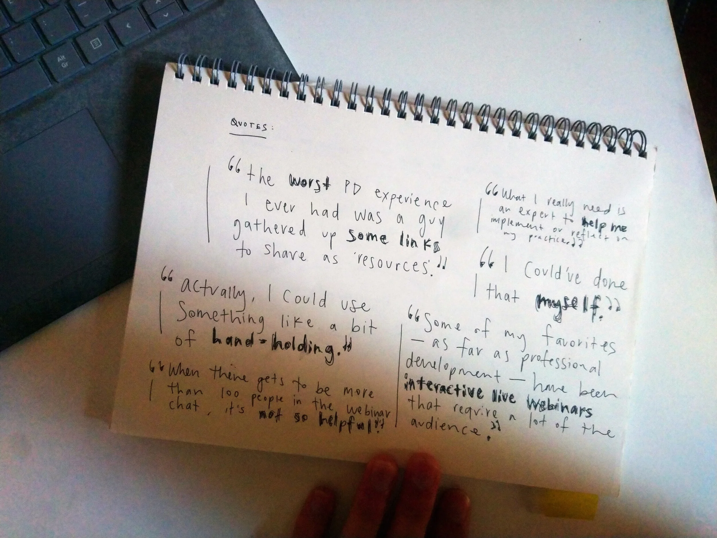
What participants said (Needs)
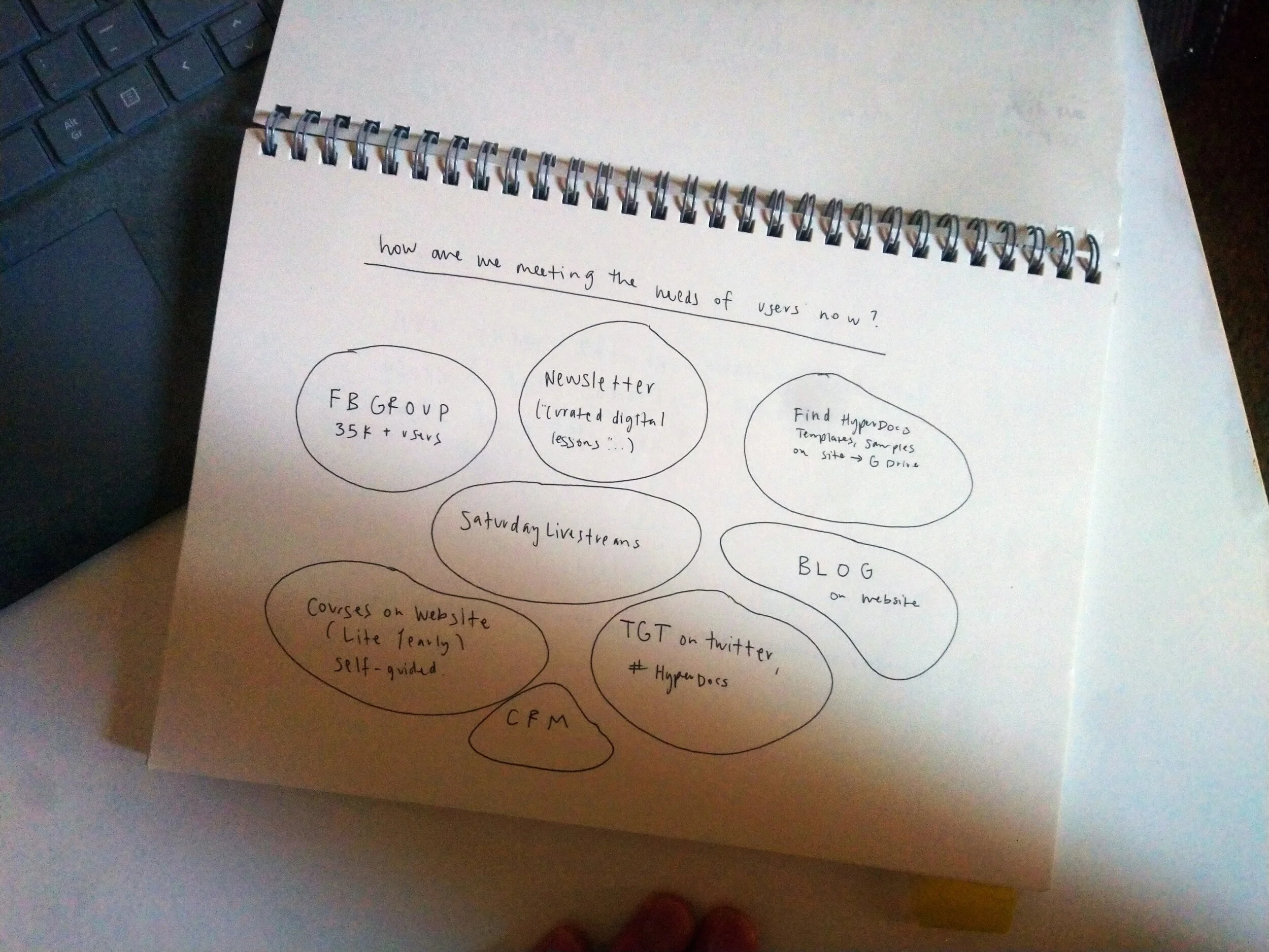
What we offer (Products)
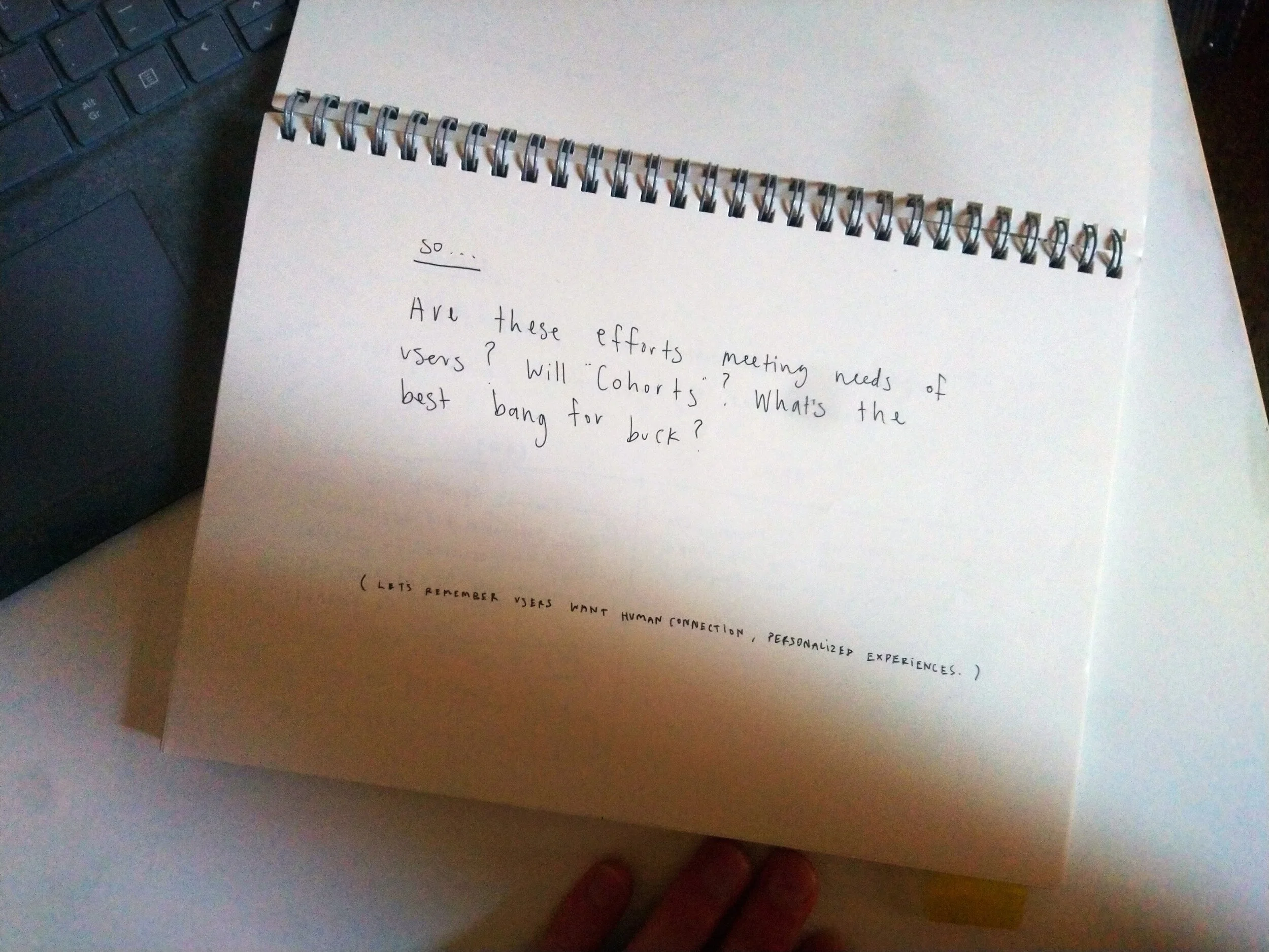
Is that enough? (Problem)
The big idea (Solution)
Event structure in 3 acts (Prototype)
Event themes, concepts (Prototype)
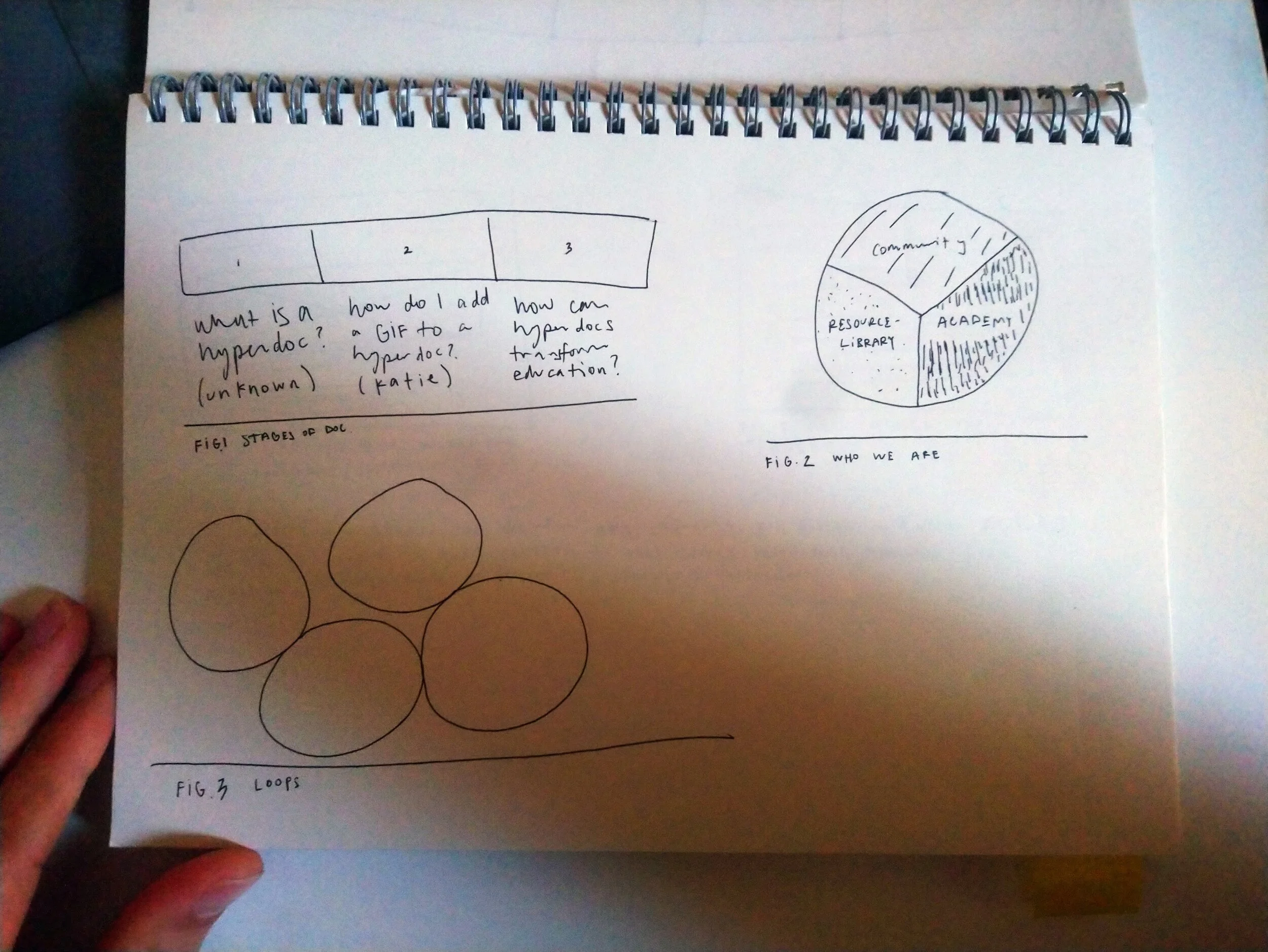
Emerging ideas
Product map
3 Implications
So what does this mean for HyperDocs? We had three things to do.
1. Improve site structure
2. Improve site content (text/visuals)
3. Improve product offerings
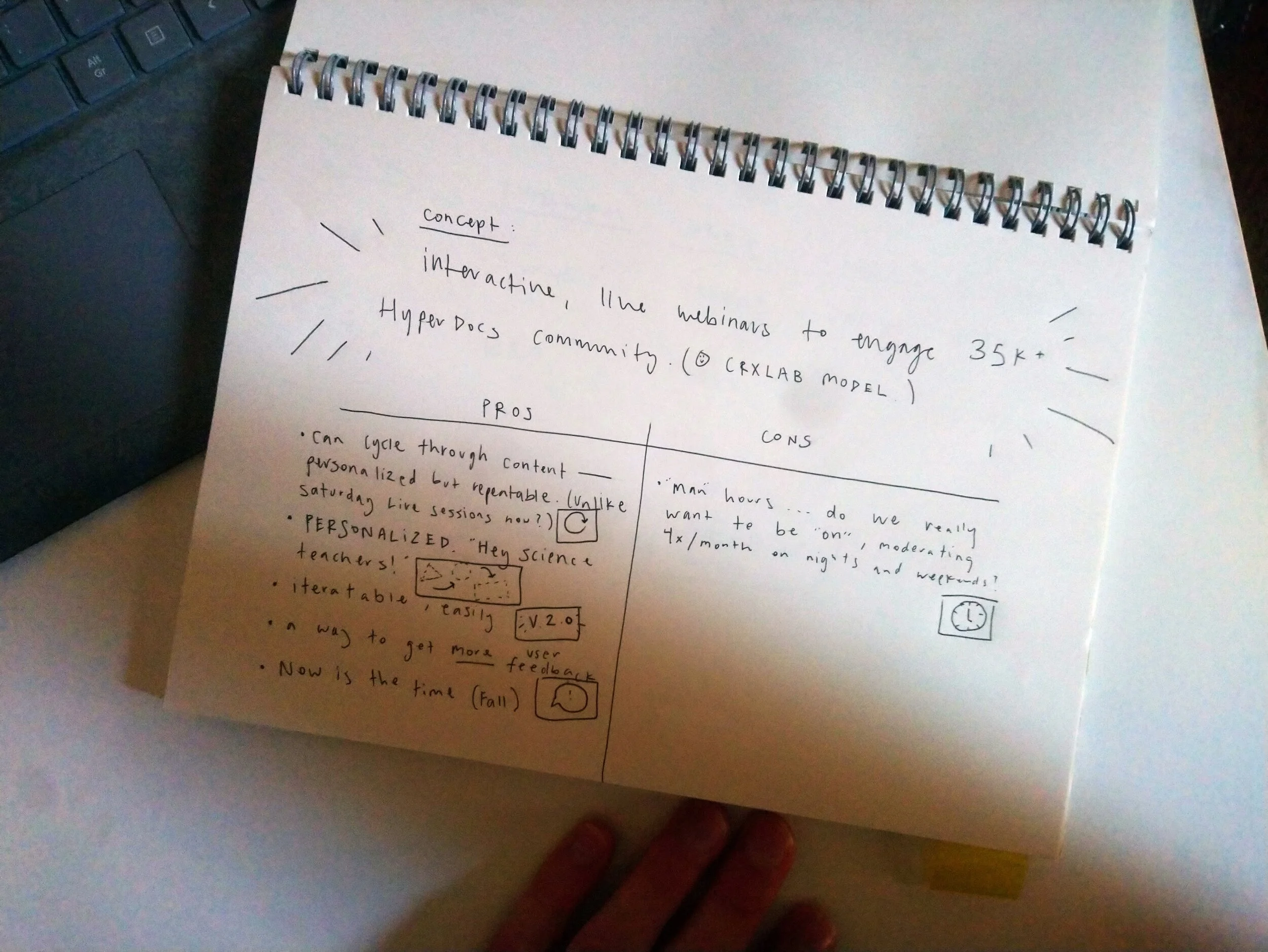
Based on the participant feedback, we chose to prioritize “improve product offerings.” Teachers asked again and again for live, interactive engagement. The courses, the newsletter, and the blog were independent and self-guided. But teachers wanted “to meet other teachers.” They wanted “to put something on the calendar.” They wanted “a bit of hand-holding.”
So, we developed a webinar series. That would serve as a “live, interactive” engagement.
Improving product offerings
Developing the webinar series
Because everyone was busy on other projects, and I was the one who spoke to the users directly, the team put me in charge of developing the webinar as a new product. Here is the project brief:
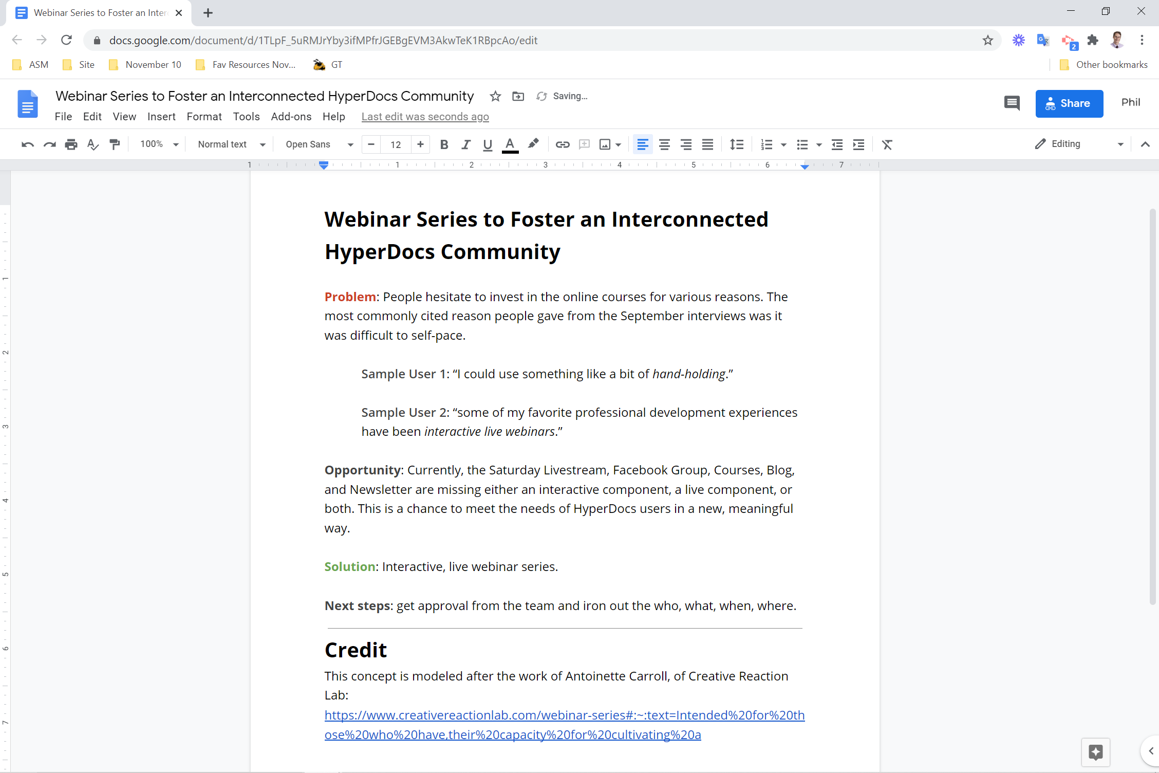
Webinar project brief
To firm up the idea, I created a mood board. This included inspiration for webinar themes, UI elements, flows, interactions, pre-roll, wrap-up, and goodie bags. That allowed for good feedback from the team. “I like X but can we change it so Y.”
If it had been a priority to get right perfectly the first time, I would have done a competitor analysis to gain a deeper understanding of webinars as a product. The main inspirations were virtual event projects by Creative Reaction Lab, The Teacher’s Guild, and AIGA Design Educators
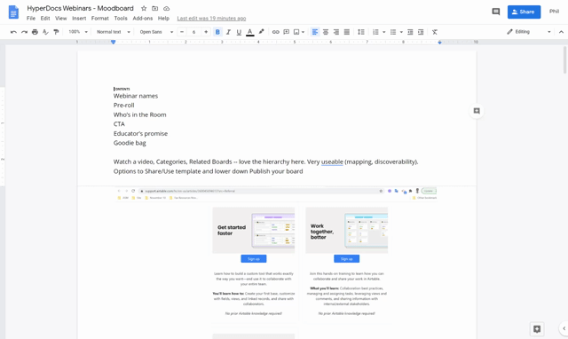
Webinar mood board
Final push
Then, I met with David, the Director of Development, to finalize the details.
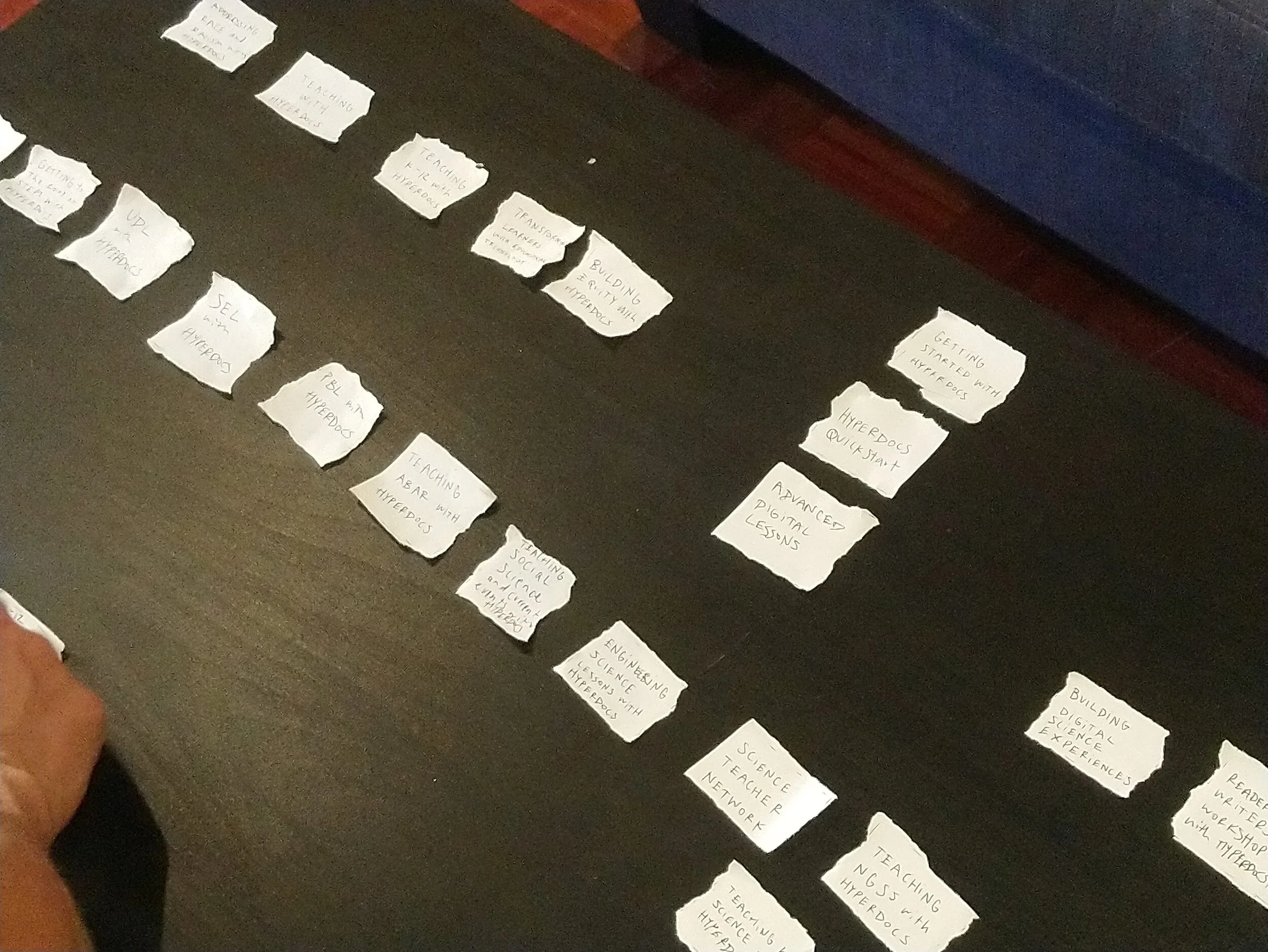
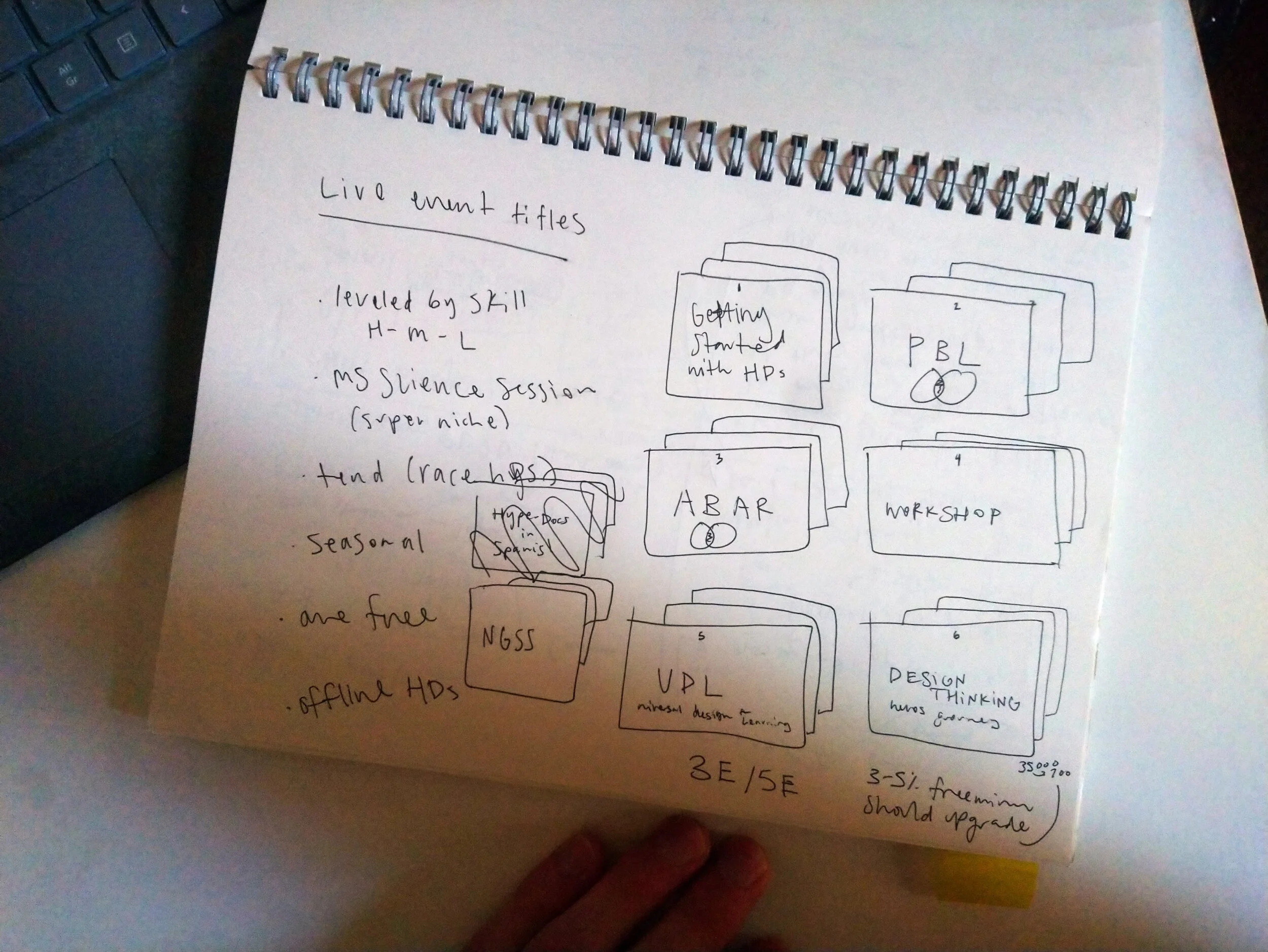
Card sorting titles to form a series
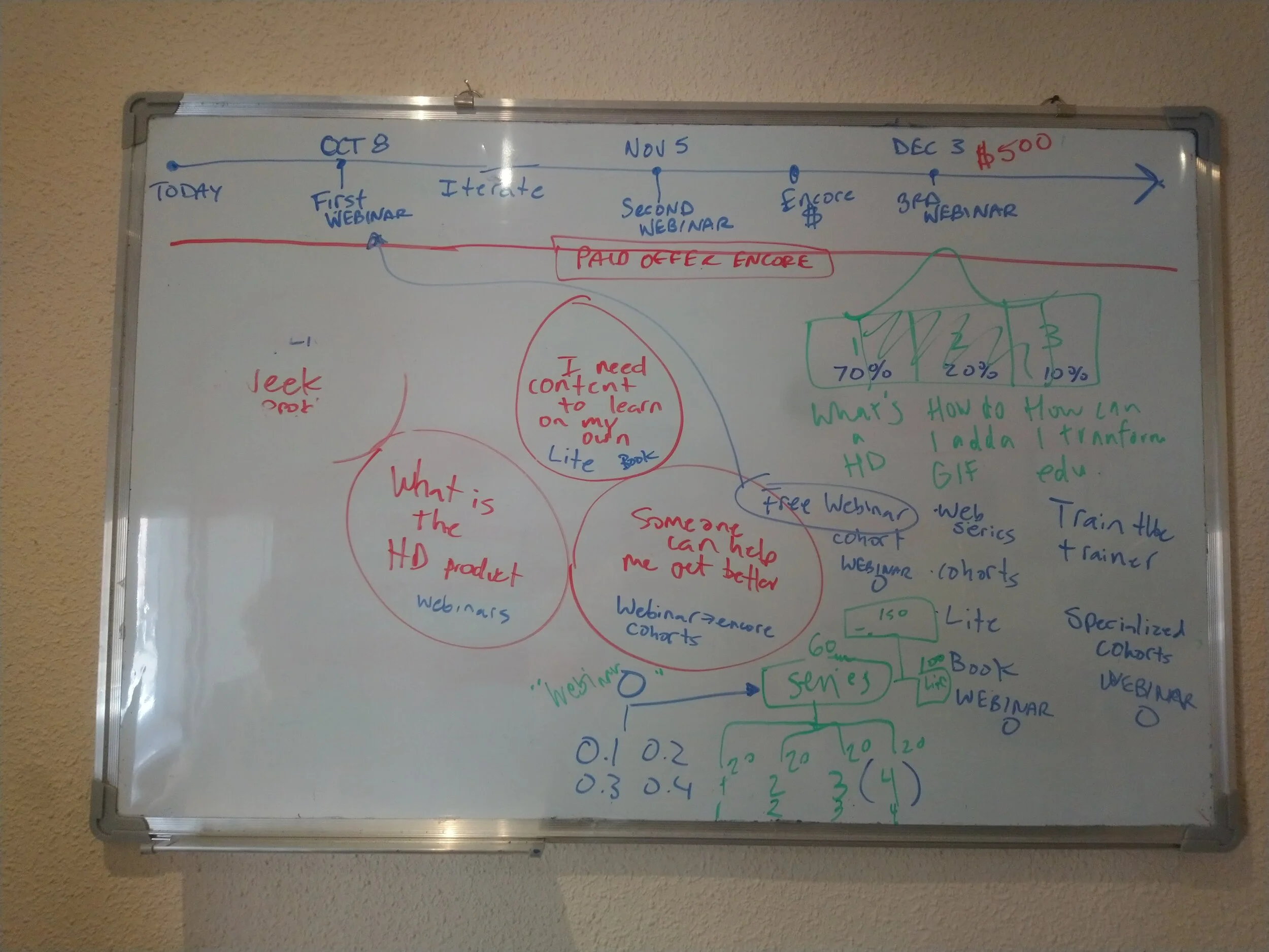
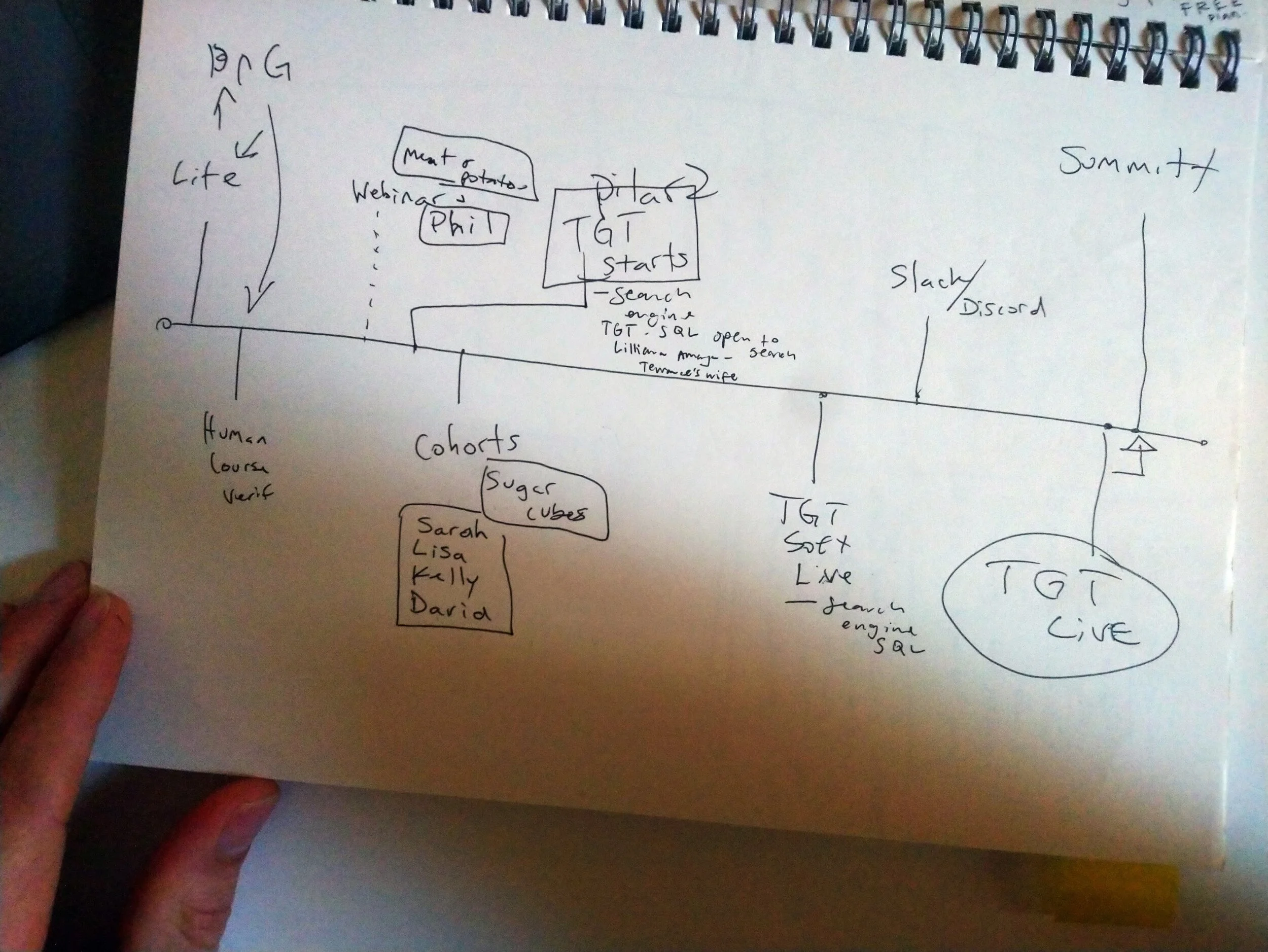
Timeline and brainstorming
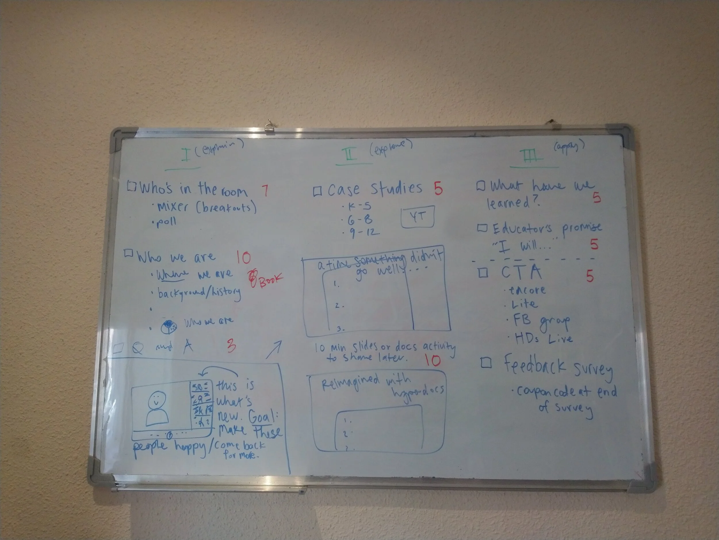
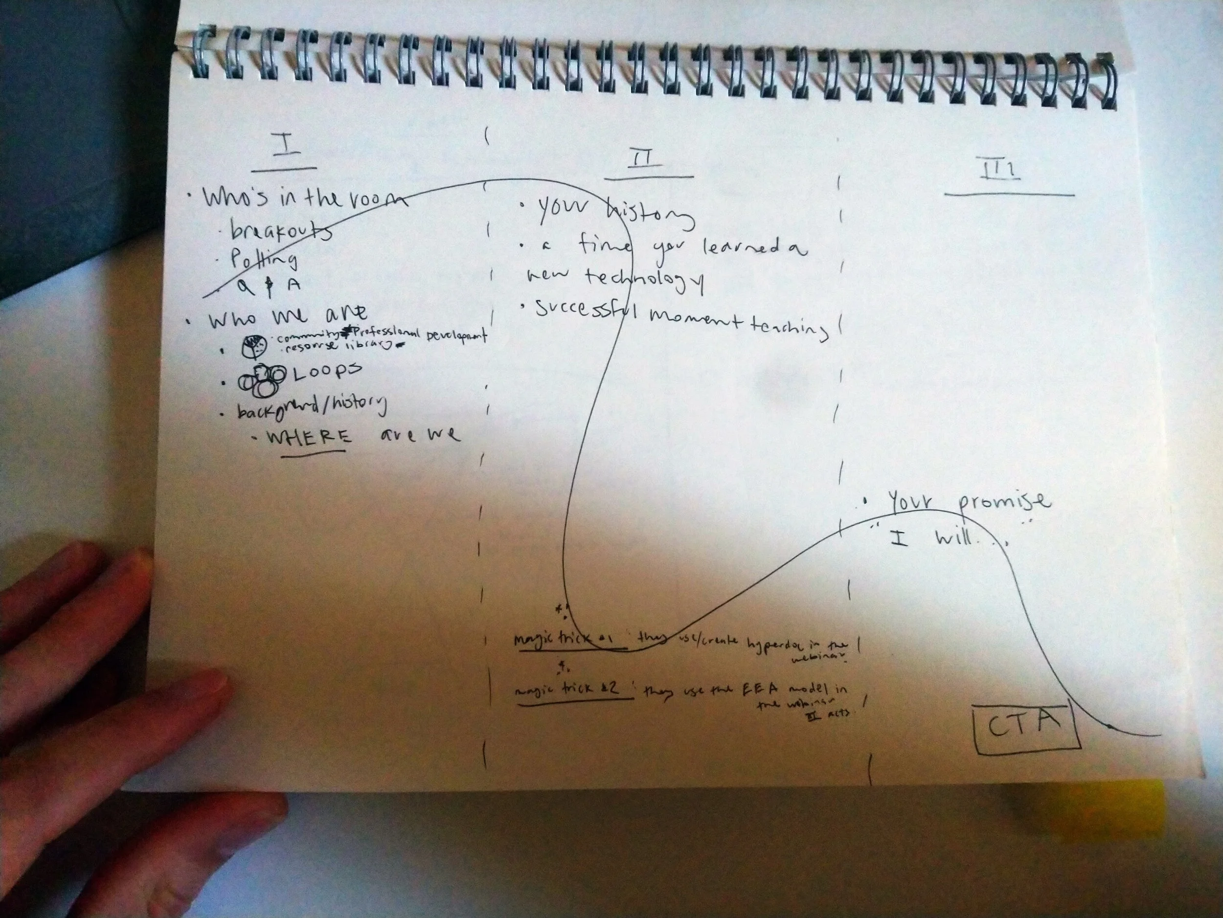
Event structure in 3 acts
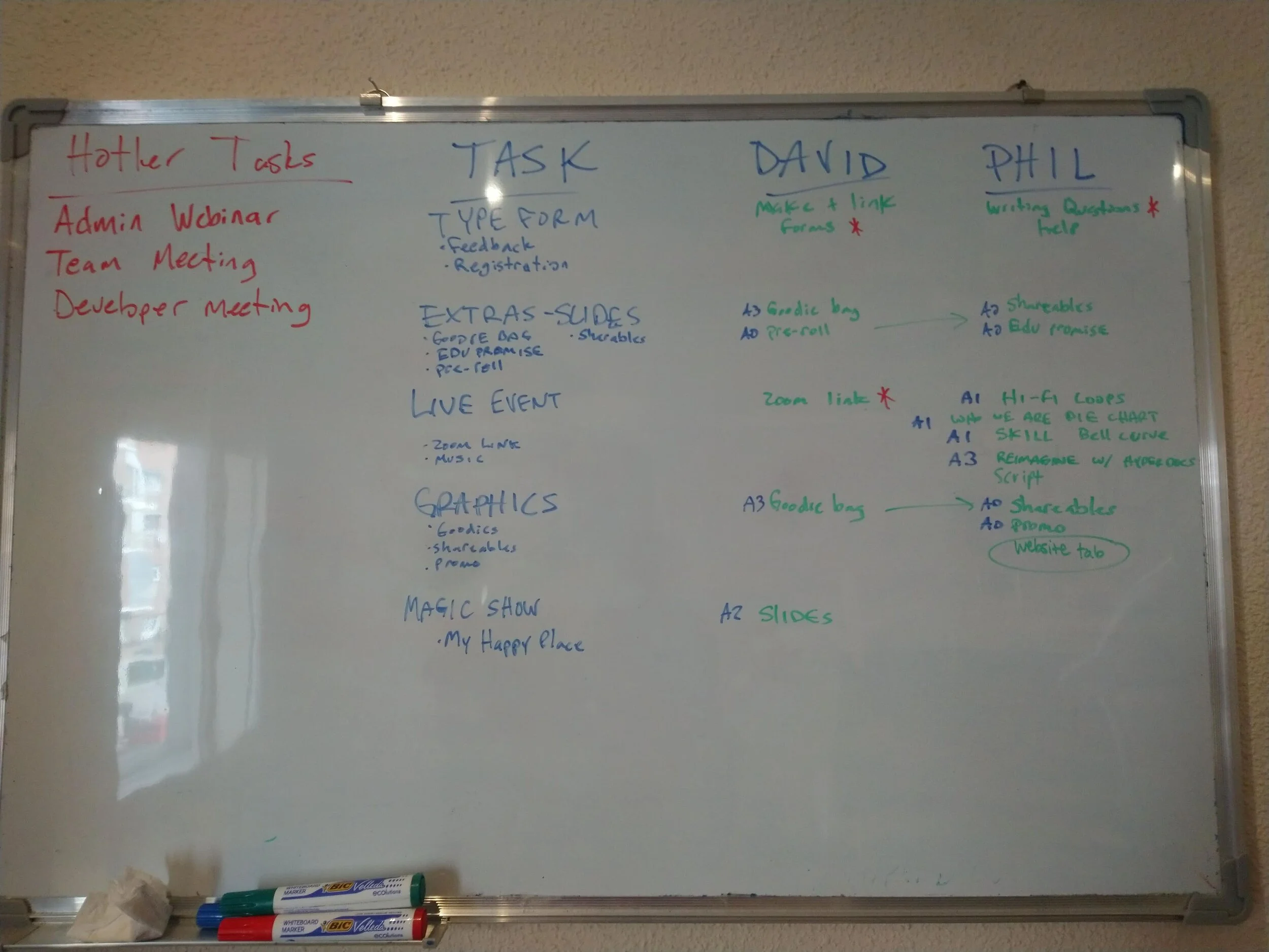
To-do list
Delivering the series
With all the prep behind us—scripts, decks, surveys—we launched our first live, interactive webinar series. Based on our brainstorming and card sorting exercises, we developed three events for November.
Teaching K-12 with HyperDocs
HyperDocs for the K-12 Administrator
Hands-on HyperDocs: Create & Connect Workshop
Outcomes
New product line (events)
14 runs of the events
1645 registrations
145 feedback survey responses
84% satisfaction rating
12 webinar coupons used toward main product line, “Academy”
3 inquiries for district-wide purchase orders
Led to hire of SEO and UX/UI Design Specialists
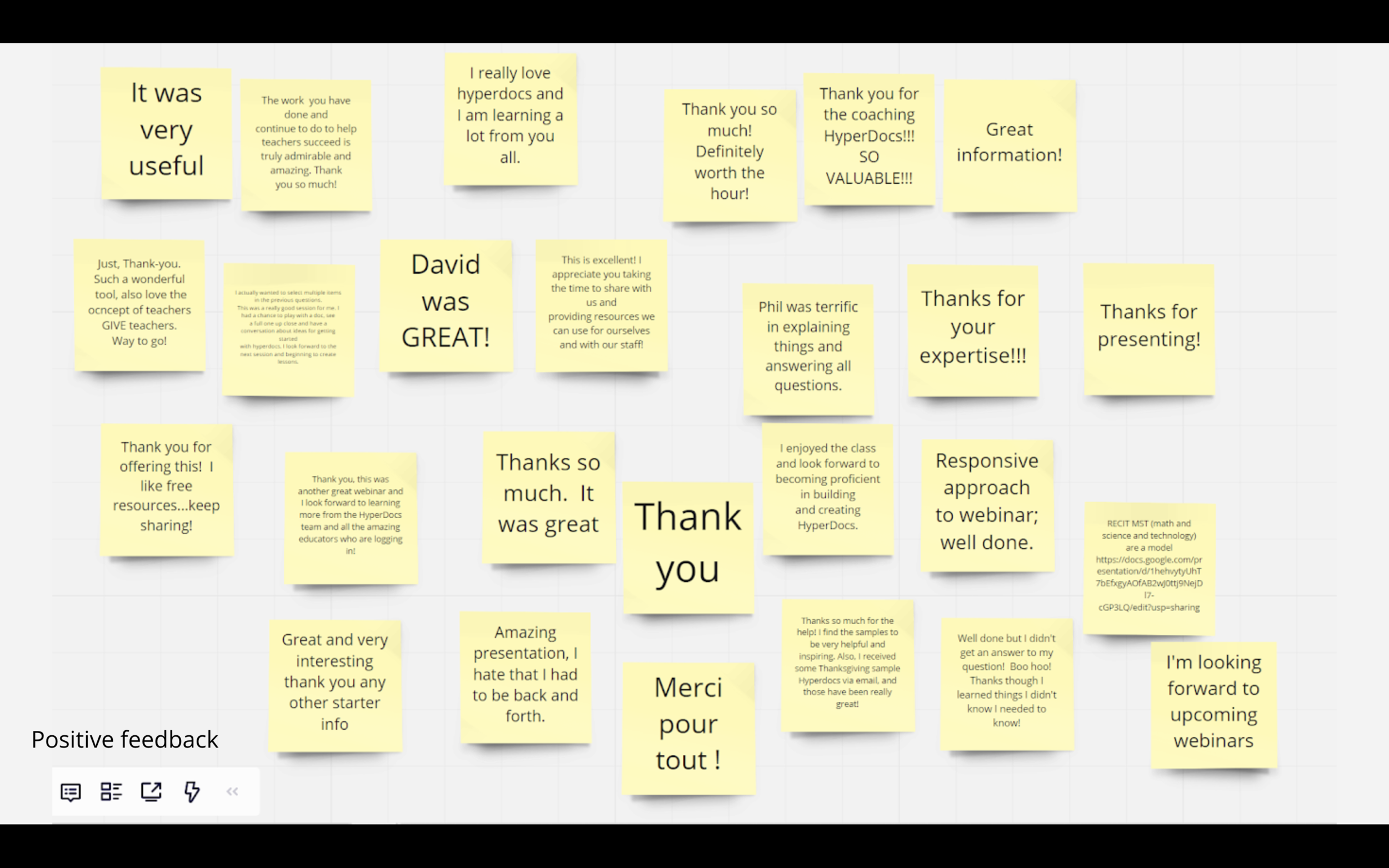
Feedback
Here is what participants said.
Reflection
We ran the Usability Tests in October and launched the webinar series in November. Things happen fast.
We never could have predicted usability tests would lead to a webinar product line. The feedback we got was very positive, which tells us Webinars was a step in the right direction. Being open pays off.
The site structure and site content are still items on our to-do list, but now that we have heaps of Webinar experience and feedback to make sense of, we have more to consider before we tackle the next thing. There’s work to do.
The best outcome of the Usability Test and Webinar projects has been gaining a more concrete understanding of who we are, who our users are, and how we can work to meet their needs. This is the most “open” HyperDocs has ever been with their stakeholders, and is truly unprecedented, which has taught us a lot. We have had fresh discussions about our mission, strategy, and communications. Interacting with users renews a sense of purpose.